I'M BAKERY
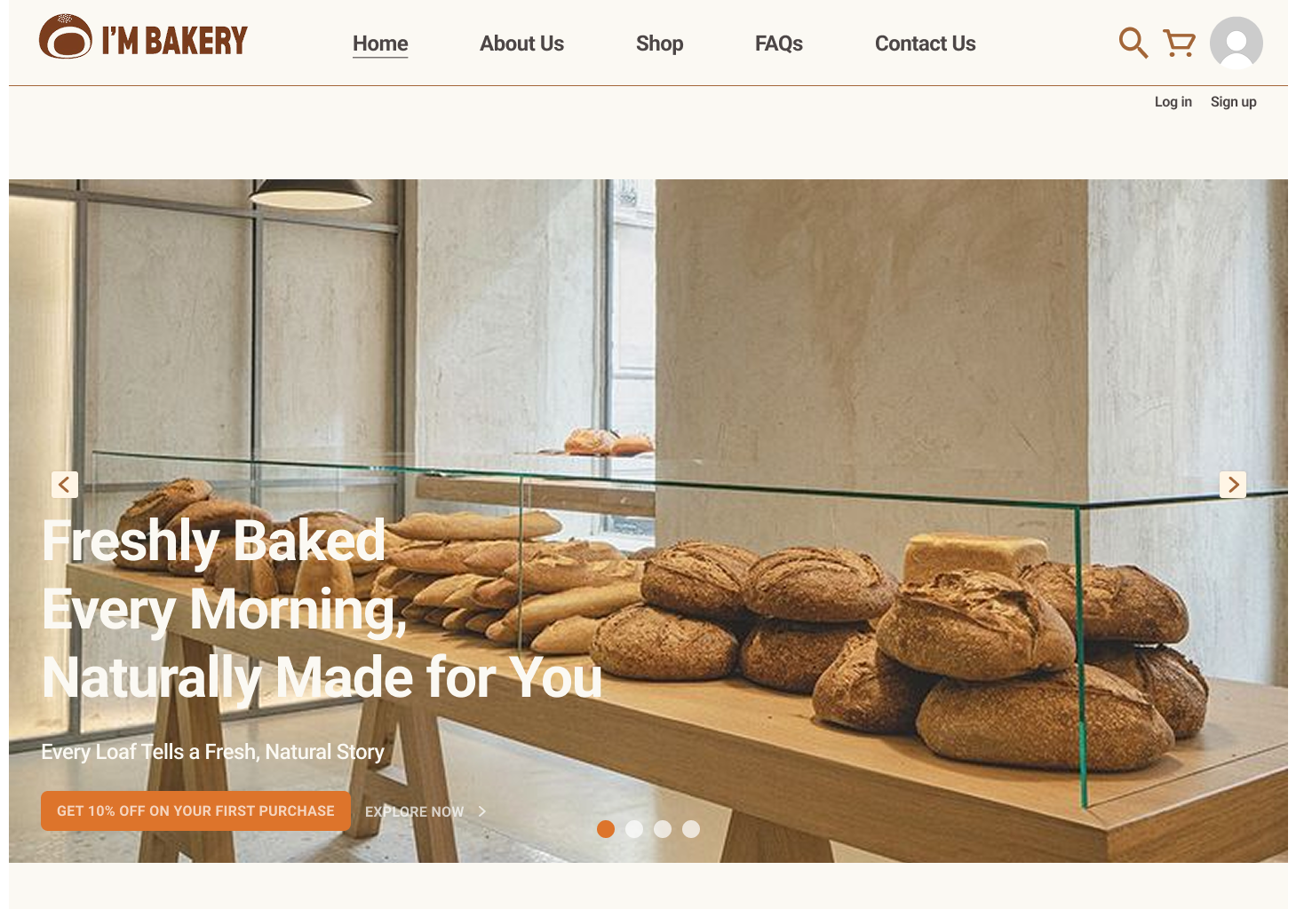
An online bakery ordering platform (Web & App) that fits fresh bread into busy schedules through flexible pre-ordering, pickup, and delivery.
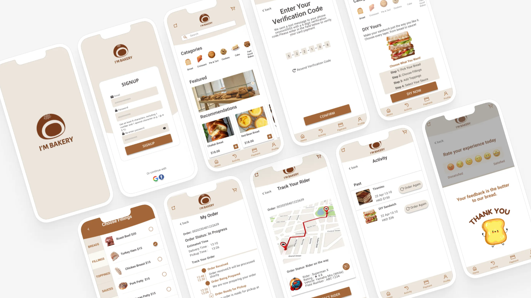
Designed for your daily routine.
Built for busy students and office workers, I'M BAKERY moves beyond the traditional walk-in experience.
By offering seamless online pre-orders, in-store pickup, and home delivery, the platform ensures you never miss out on your favorite bread, even on your busiest days.
It's all about flexibility. This project focuses on saving users' time and removing the uncertainty of in-store availability, making fresh bread a convenient part of any daily routine.
Solving real-world bakery challenges.
My goal was to simplify the traditional bakery experience. From initial sketches to user testing, I focused on bridging the gap between busy customers and local shops — creating a process that saves time for users while helping bakeries reach a wider audience.
Three iterations shaped by user feedback.
Based on insights from usability testing, I made three key design changes — focused on making the product intuitive, efficient, and delightful to use.
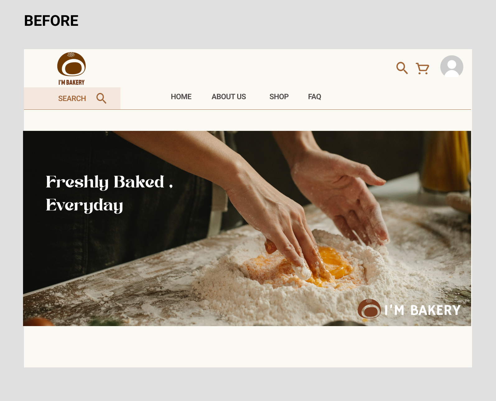
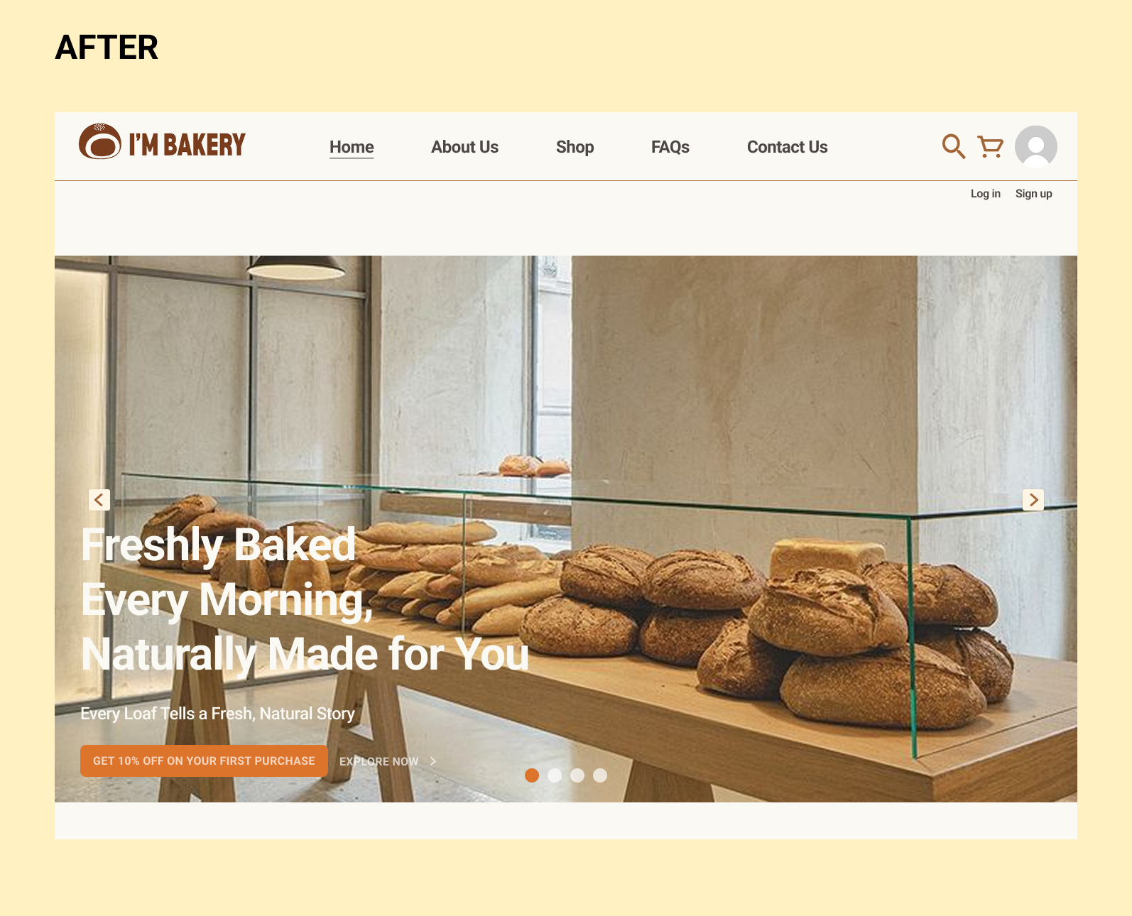
Clearer choices, simplified process.
The design prioritises clarity and intuitiveness, creating a simple and fluid layout. Users navigate and view content more instinctively, significantly enhancing their experience.
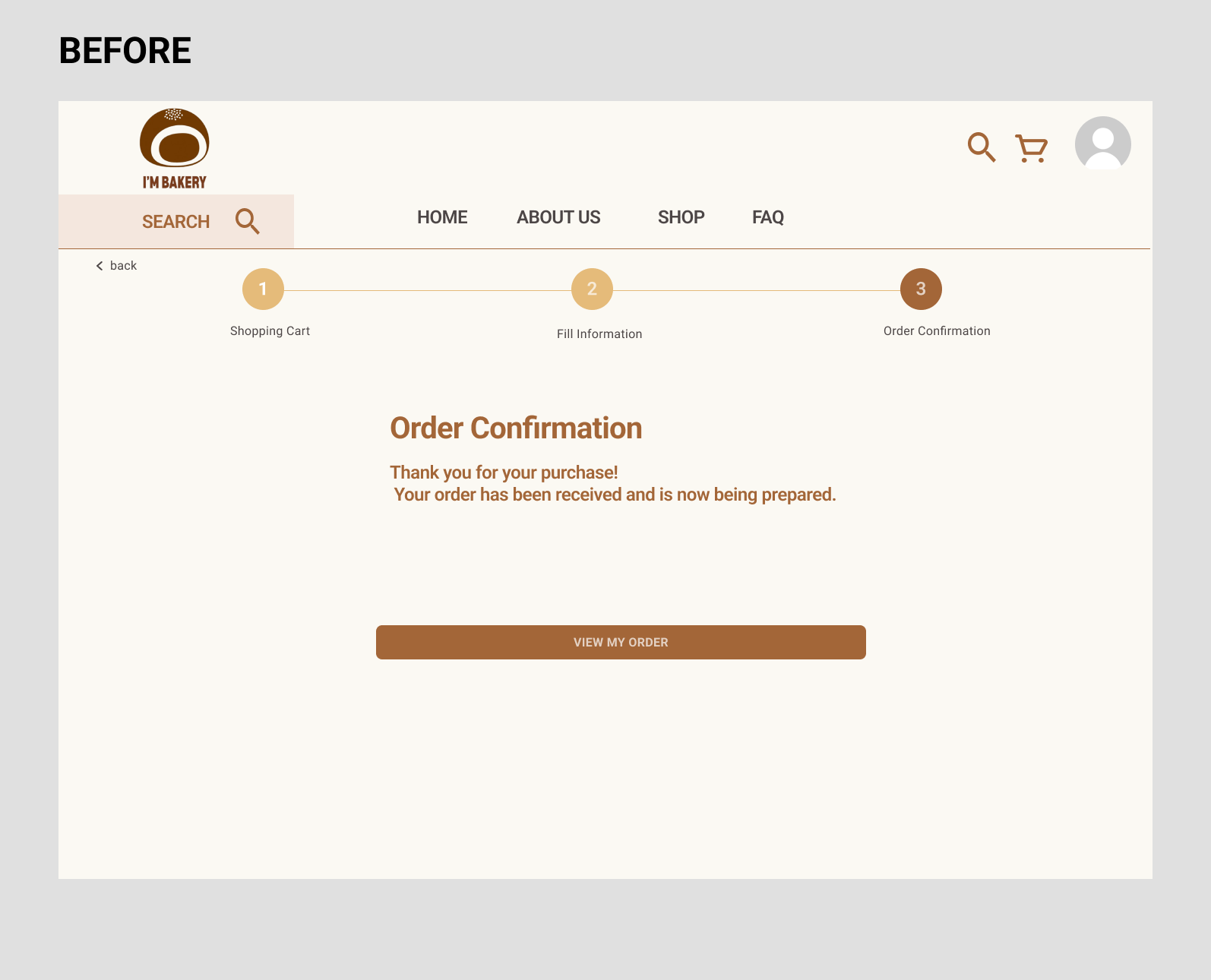
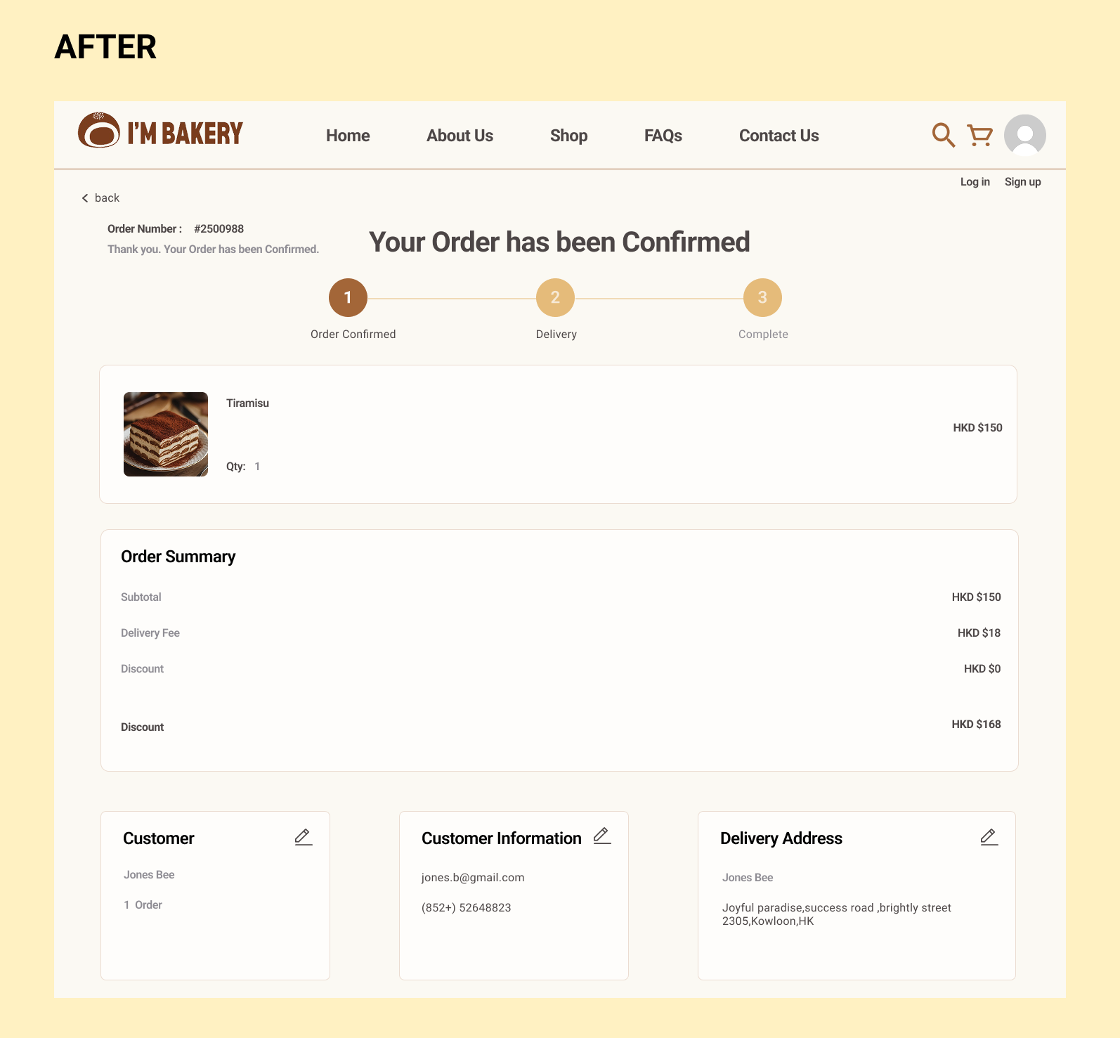
Clearer order confirmation.
I optimised the payment confirmation page. Previously, it only showed "order confirmed." After the iteration, I added full order details so customers can clearly review the items they've paid for — enhancing information transparency.
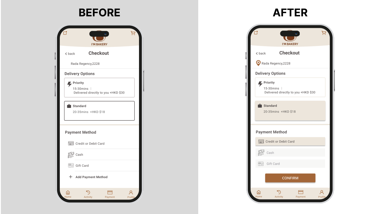
Enhanced visual recognition.
Users found the selection feedback unclear, so I changed the original outline display to a filled-in state. The clear visual contrast significantly improved its visibility.
A quick tour of the product.
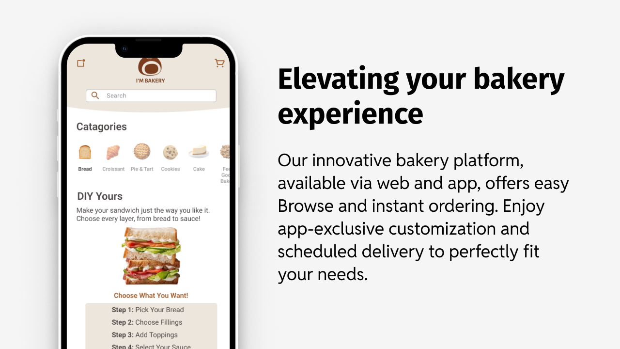
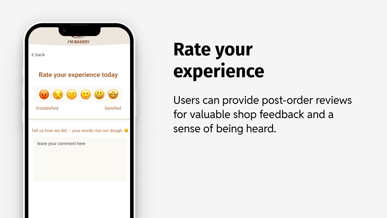
From sketch to interactive prototype.
I transformed my ideas into an interactive low-fidelity digital prototype and tested it with five potential users to validate the design and gather feedback.
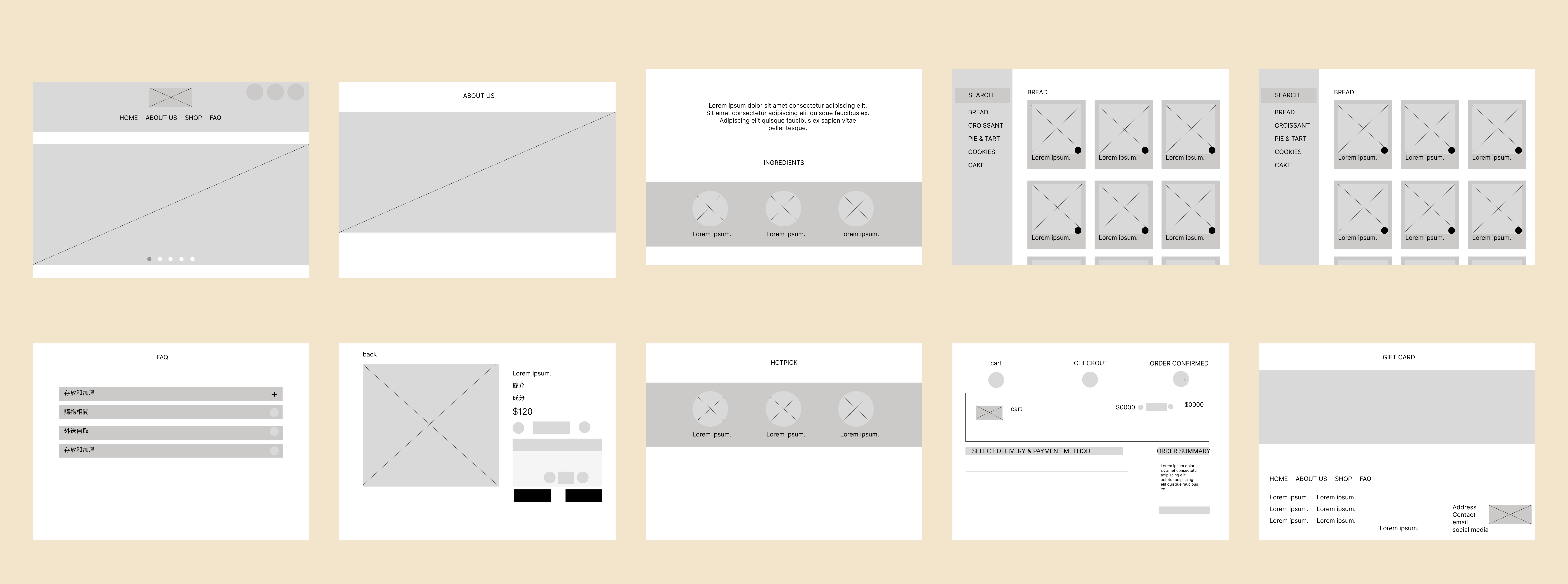
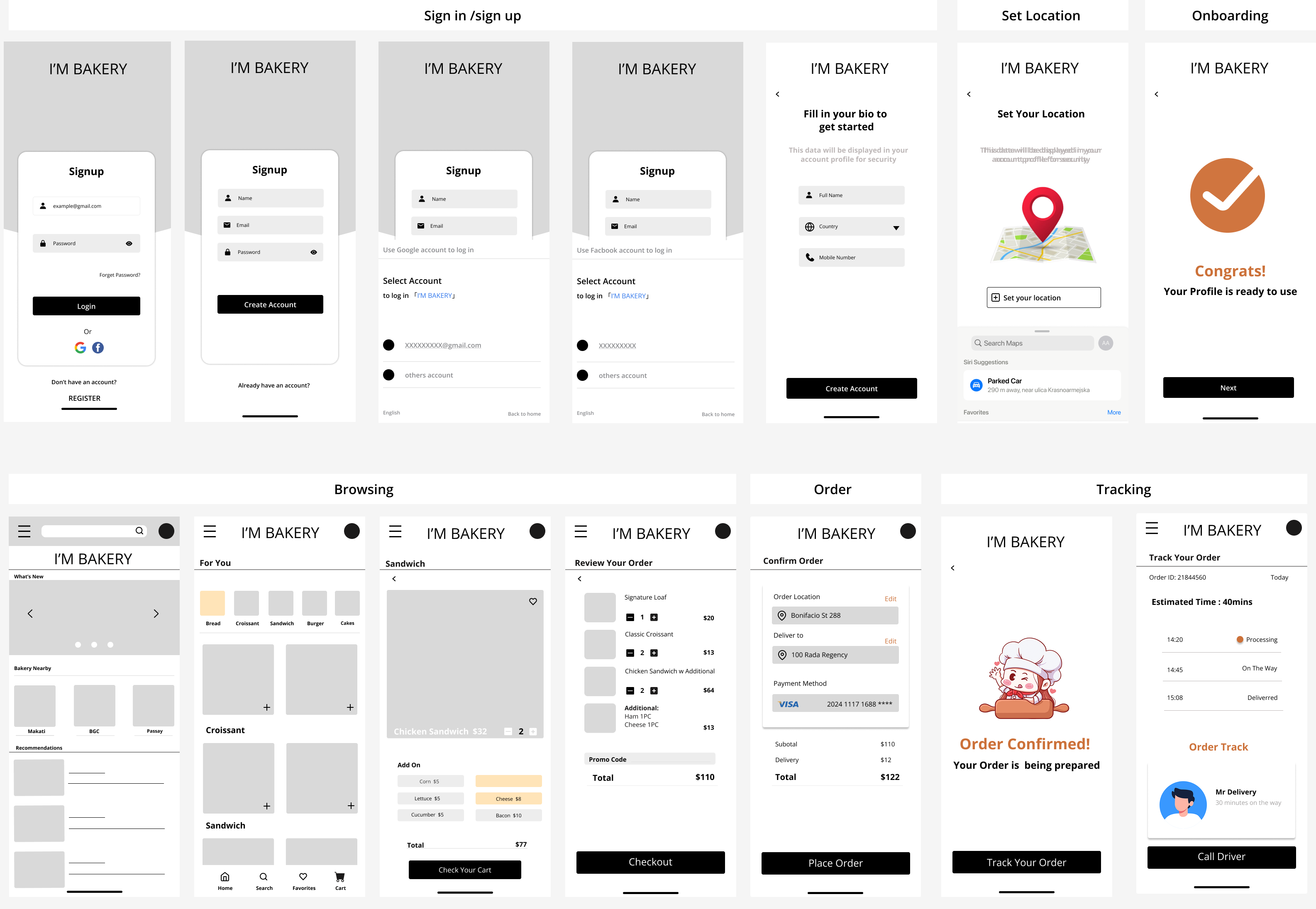
Ready to explore?
Click below to open both App and Website prototypes directly in Figma.