DESIGN YOUR LIFE
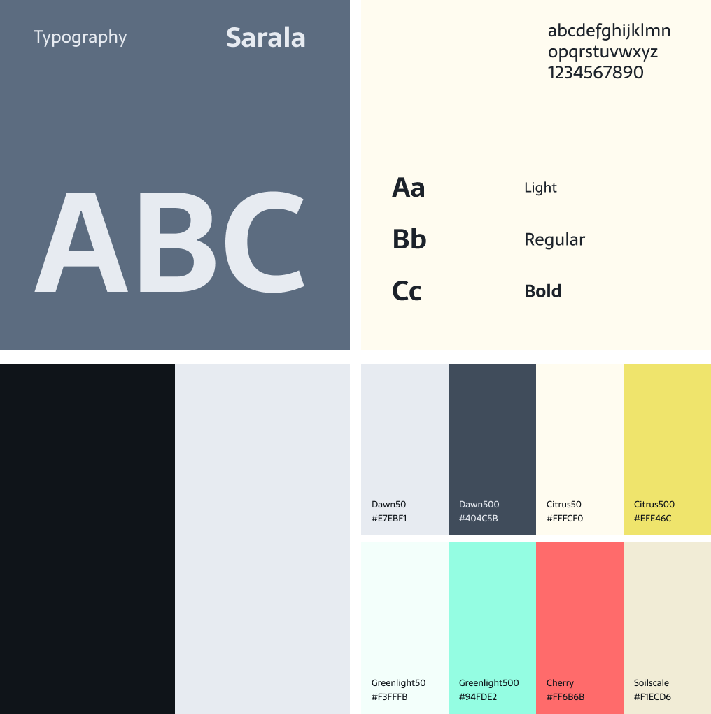
An iOS platform that sparks career inspiration and discovery. Designed within a month, featuring interactive career quizzes, industry insights, and practical interview tips, all supported by a cohesive, modular design system.
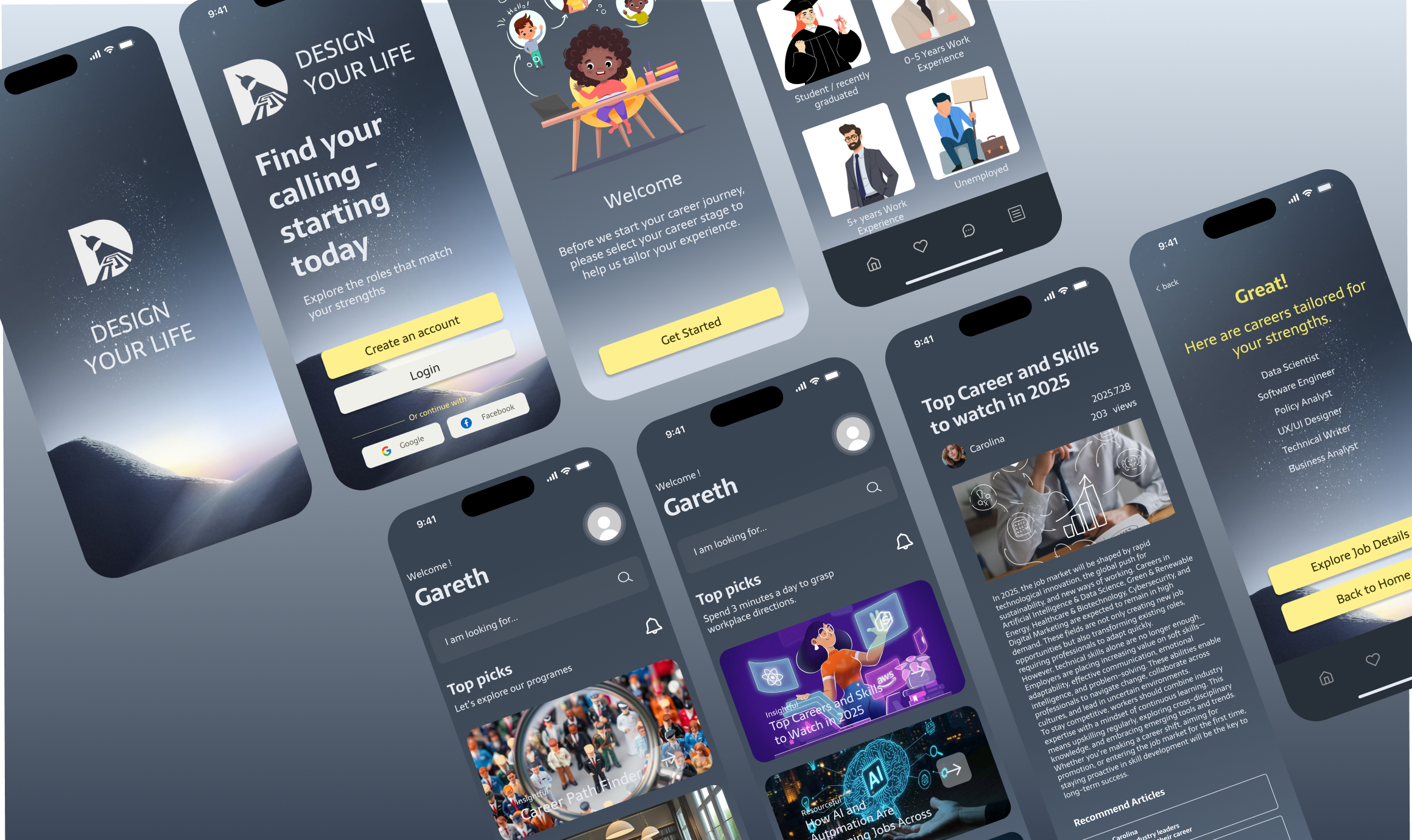
From Insight to Impact.
Designed the "DESIGN YOUR LIFE" iOS platform to support users standing at career crossroads. By blending self-discovery tools with real-world resources, the app guides users to explore new industries, stay updated with market trends, and master interview strategies to unlock their true potential.
Career exploration without the right tools.
Many individuals feel lost or unfulfilled in their careers, often lacking accessible tools to guide them. Our goal was to create an integrated career planning platform offering self-assessment and personalised insights, eliminating external dependencies and thereby enhancing user stability and streamlining the career exploration journey.
Guiding users toward their future paths through intuitive design.
This project focuses on how today's youth actually look for career direction. Instead of using complex corporate frameworks, the app simplifies industry exploration, making it easy for users to browse insights, take assessments, and find their own way forward.
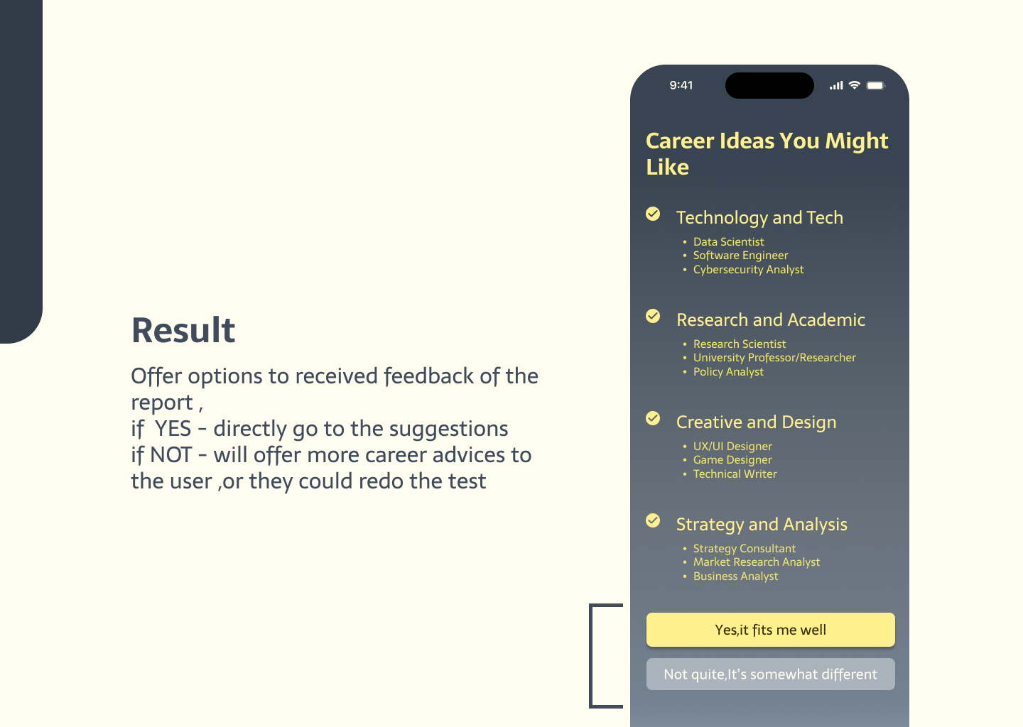
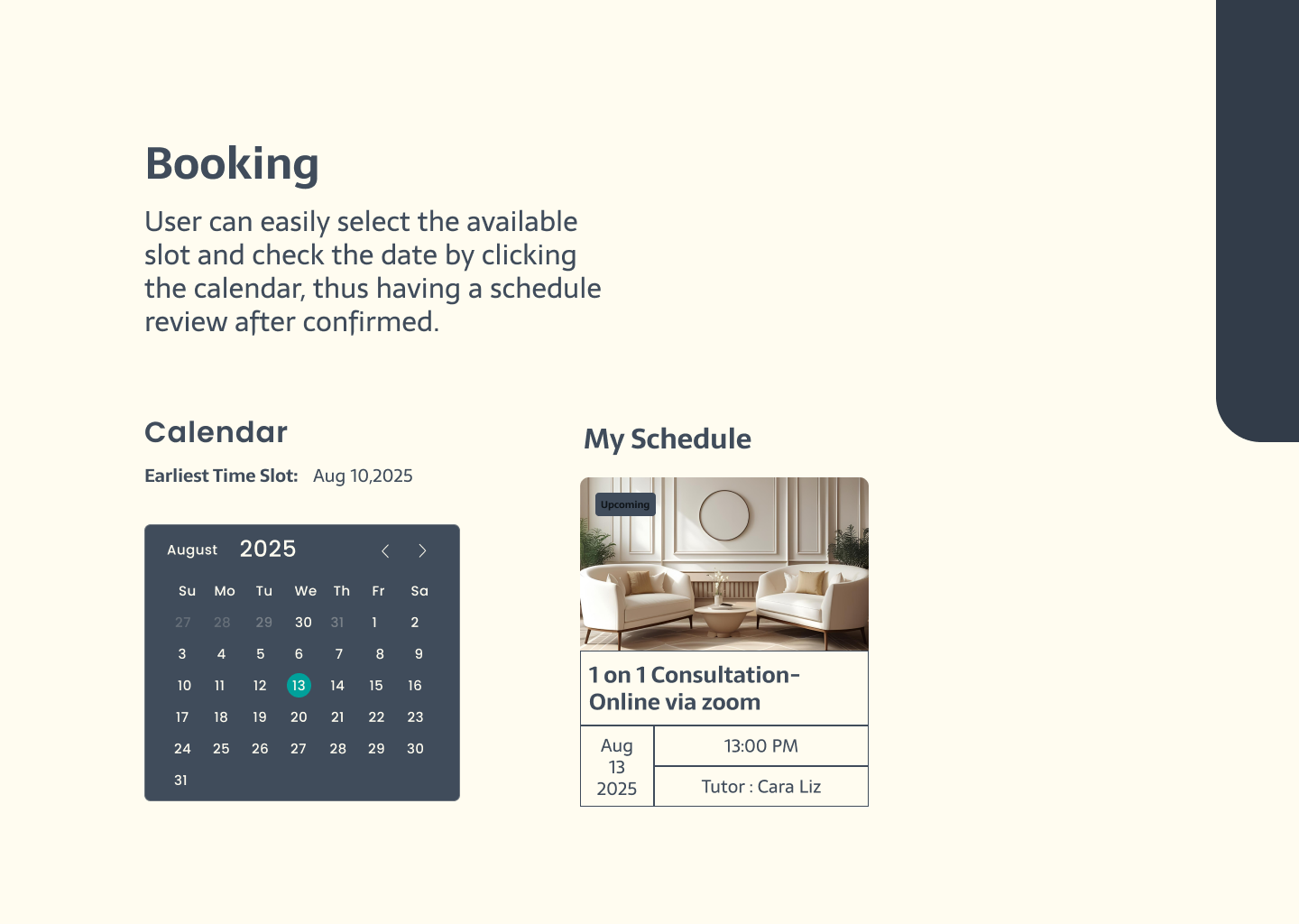
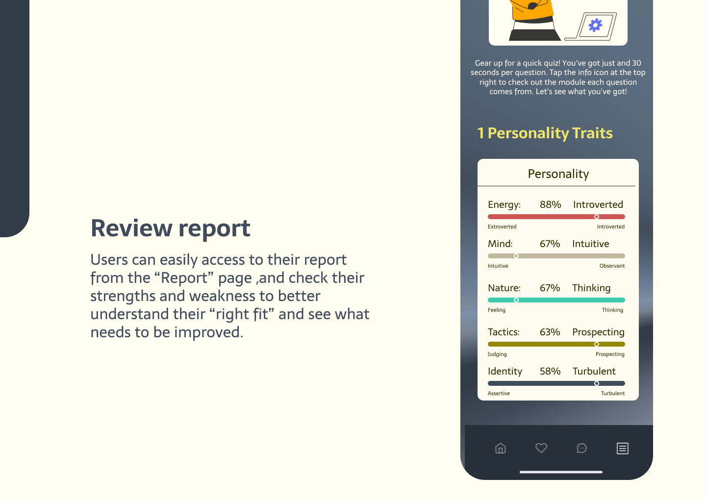
Refined through 3 iterations for maximum usability.
Through three rounds of rigorous testing and prototyping, I identified and resolved key usability pain points. This iterative process ensured the final design was not only visually engaging but also highly functional, resulting in a cohesive experience that bridges user goals with platform features.
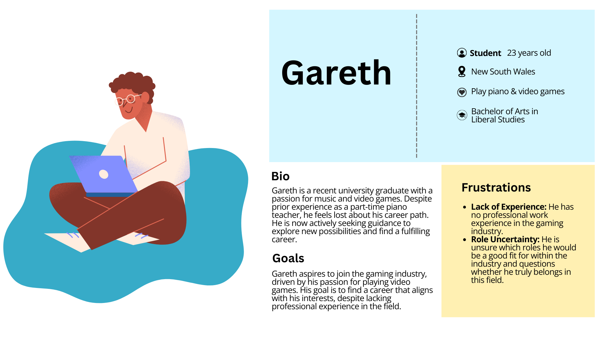
Meet Gareth — navigating post-graduation uncertainty.
I did moderated user research to gather feedback directly from users, then used that key information to build user personas. For example, Gareth — one of our personas — is navigating the post-graduation uncertainty. He has no clear idea about starting his career or what job might fit him. Even though friends and family gave advice, he doesn't think it's right for him and can't find expert, unbiased guidance.
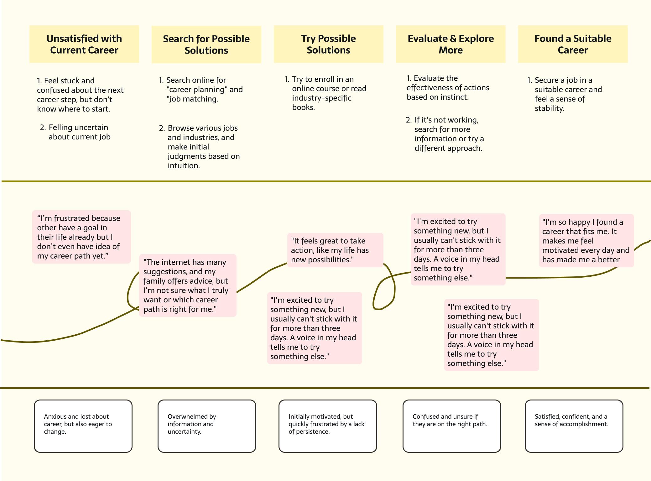
I also created a user journey to better illustrate the difficulty many people face when transitioning in life and attempting to evaluate and form new habits.
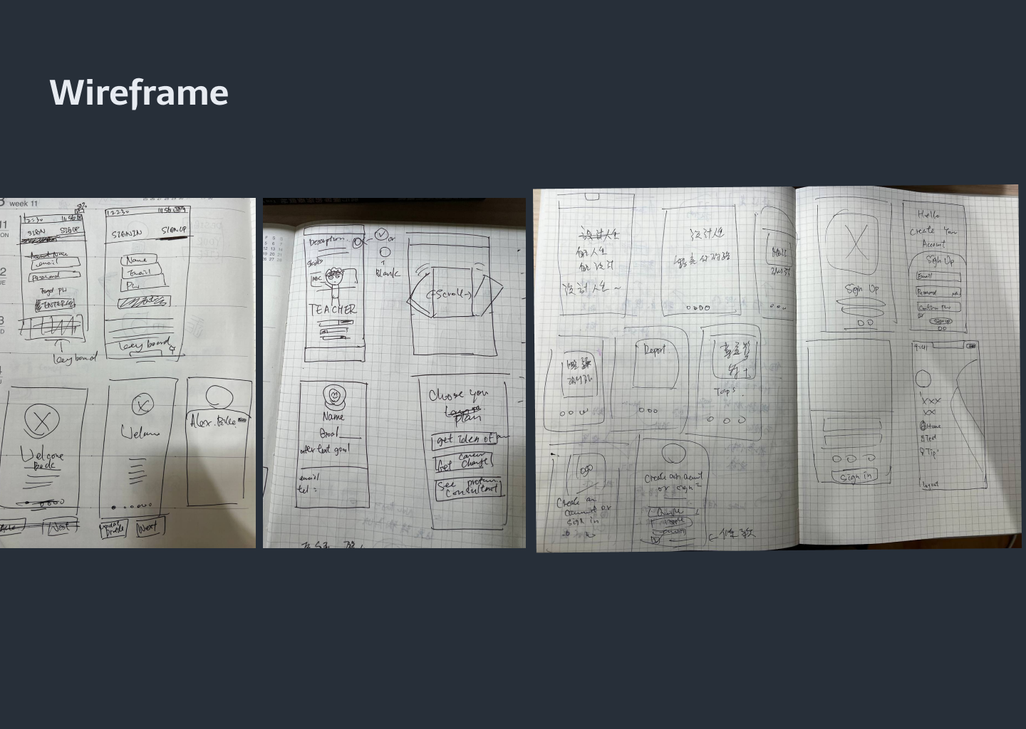
From sketch to high-fidelity prototype.
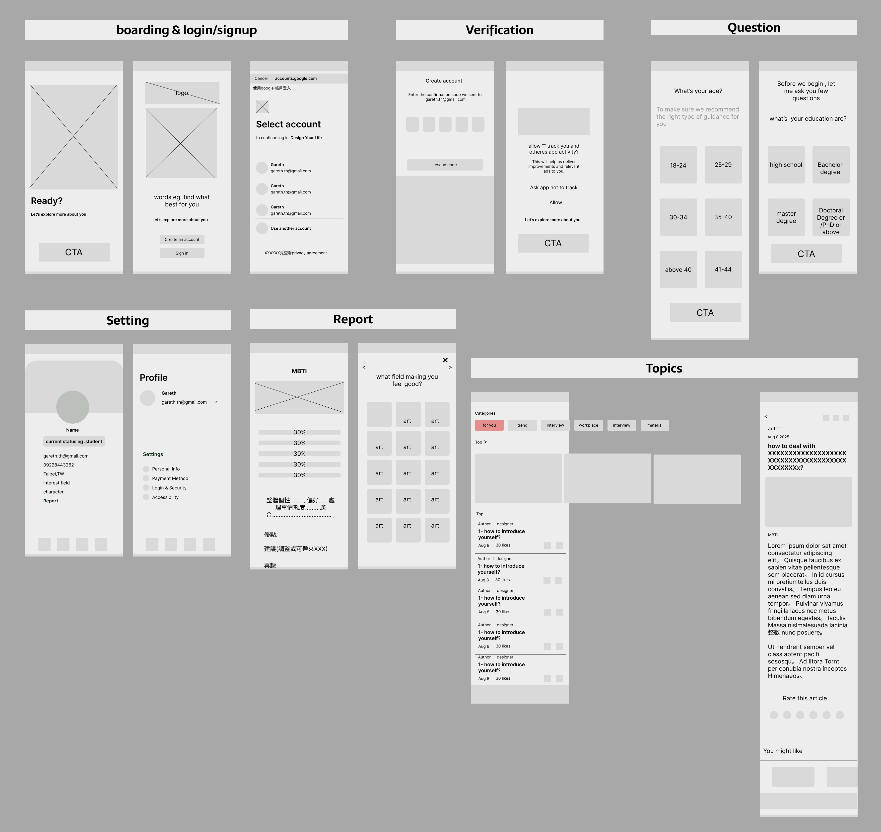
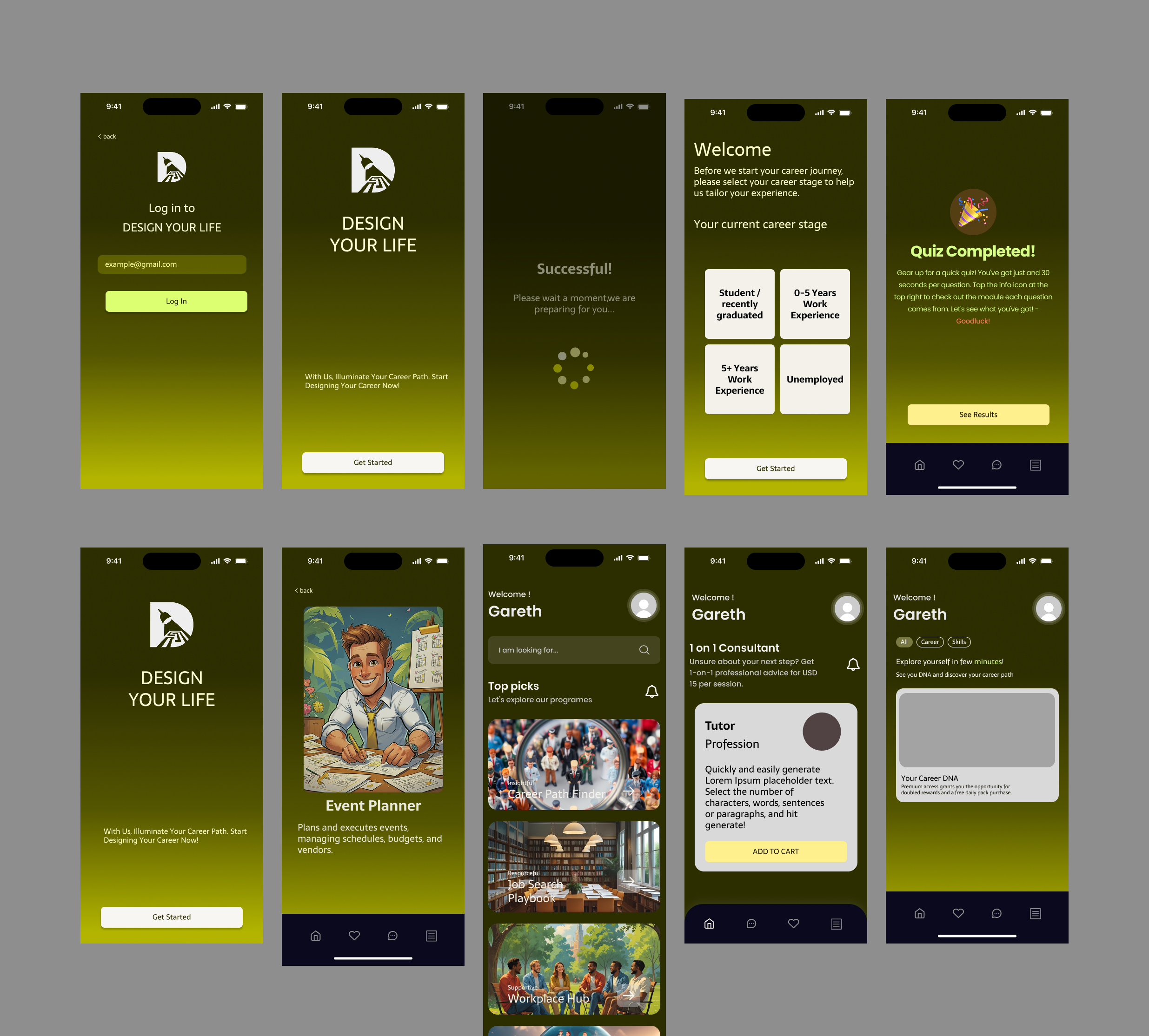
This process begins with my initial wireframes, progresses to mockups, and culminates in a high-fidelity prototype. This simple version demonstrates my design approach and how I adapt it to best suit user preferences.
Lo-fi prototype tested with five users.
I transformed my ideas into a low-fidelity digital prototype, which I brought to five potential users to gather initial feedback.
Card sorting surfaced the platform's core themes.
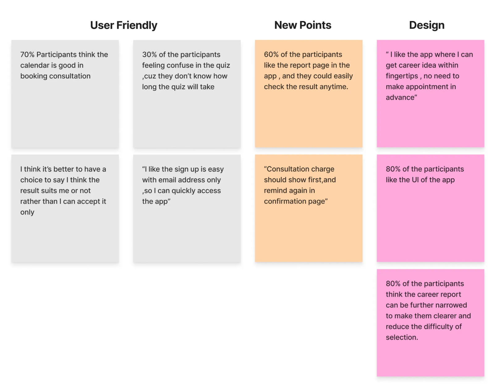
I conducted user testing sessions with five participants to gather qualitative feedback. Following the sessions, I performed a card sorting exercise to synthesize the findings and identify core themes that informed the platform's information architecture.
Three changes shaped by usability feedback.
Based on insights from usability testing, I made three key design modifications. My focus was to directly address user comments and suggestions, aiming to create a product that was intuitive, efficient, and delightful to interact with.
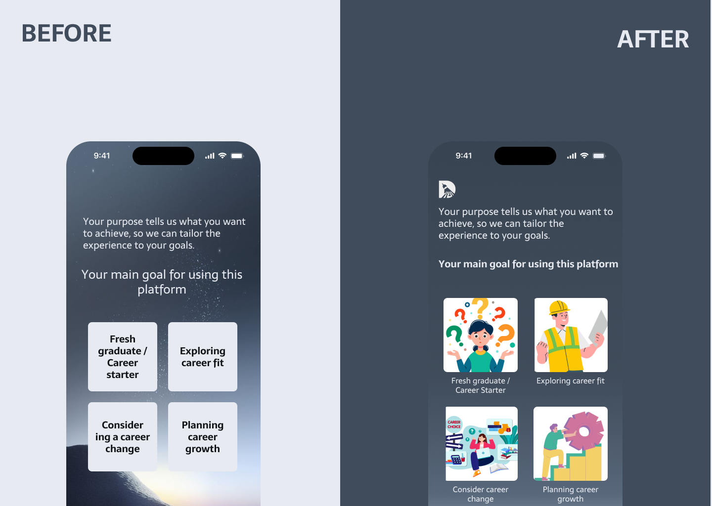
Pictures are more intuitive than text.
According to user feedback, adding images would enhance clarity. So I added images to the questions — improving recognition and making the questions more engaging and intuitive to answer.
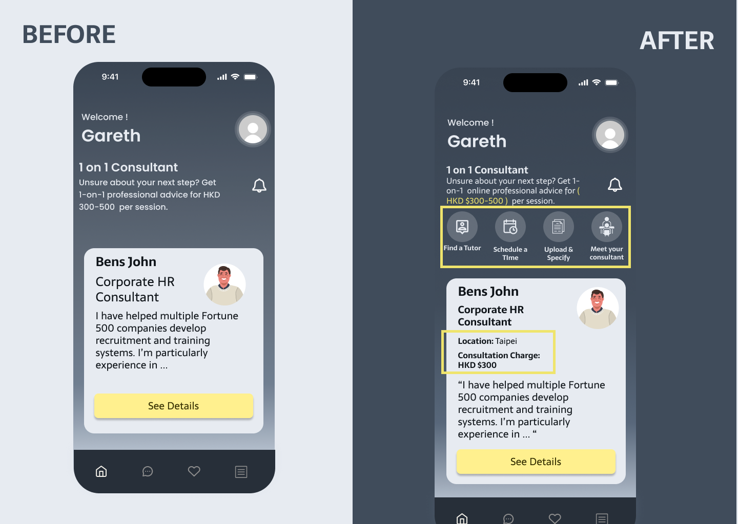
A clear and easy-to-follow process.
Adding a consultation flow makes the process steps clear at a glance. I also listed mentors' locations and fees so users get a fuller understanding and pre-awareness of the costs, increasing their control over the information.
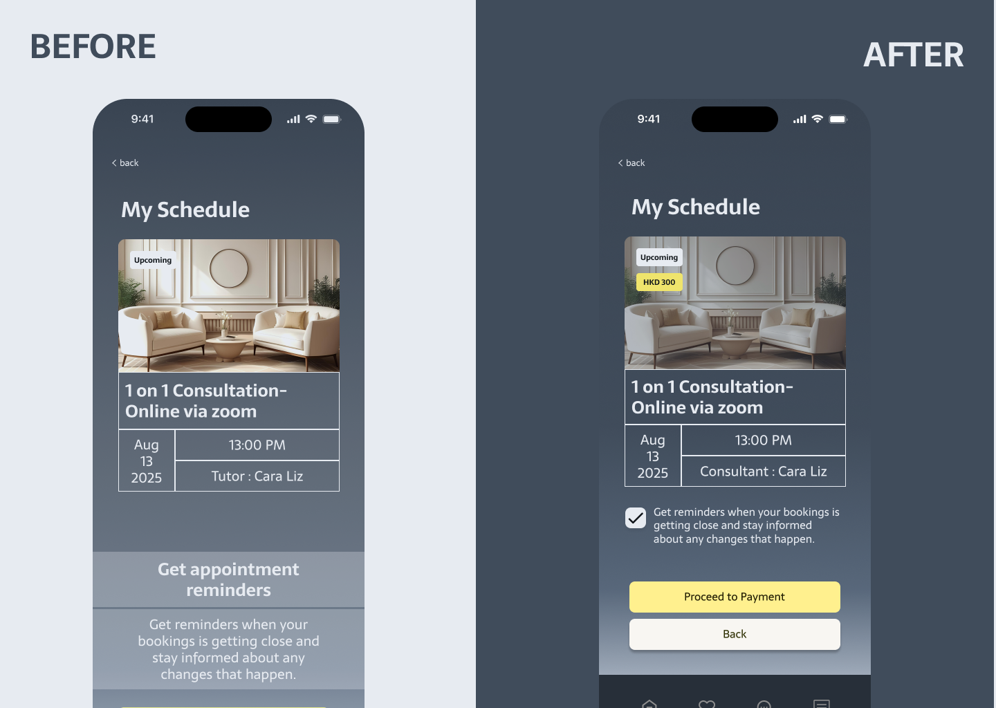
A confirmation step to prevent accidental purchases.
I added a "Confirm" button so users review all consultation details before proceeding to payment. This ensures pricing is transparent and fair.
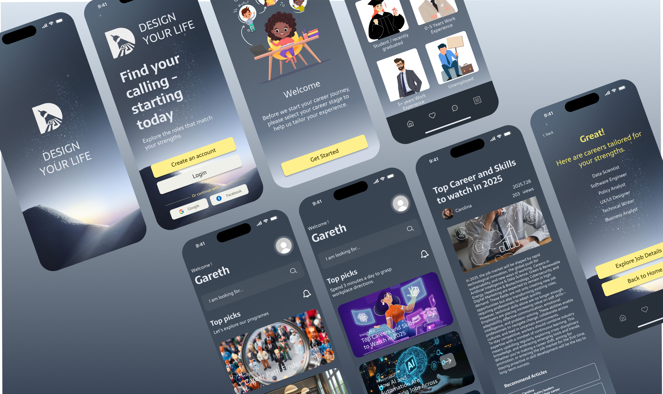
The final design.
Ready to explore?
Click the image below to open the App interactive prototype directly in Figma.